2017 Alive & Thrive Redesign Website
to Progressive Web App
Situation
The existing website was due for a redesign as Alive & Thrive moved into the second phase of their modernization. Audience interviews and surveys revealed a disconnect between perception and mission, usability issues, and large gaps in meeting user needs. Much of the audience travels extensively including to remote areas where electricity and Internet connectivity are unreliable. Serving such vulnerable populations in sensitive circumstances, A&T saves lives, so reliable access to this material is vital.
Audience
Global external partners and internal staff
My Role
Lead Designer
Team
- Project Manager
- UX Designer (me)
- UX Strategist
Skills Used
- Content Strategy
- Information Architecture (IA)
- Mentor Junior Staff
- Rapid Prototyping
- Technical Documentation
- UX Design
- UX Research
- UX Strategy
Actions
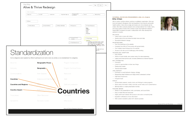
- Understand the audience. Partnering with the Account team and a Digital Strategist we conducted three dozen user interviews of external partners and internal stakeholders. Consolidating the findings into personas [187kb PDF], and strategic recommendations including a progressive web app optimized for connectivity challenged use cases, and leveraging in-browser notifications for new material updates.
- Organized and labeled from the audience point of view. Conducted card sorts, treejack tests, and surveys, we established a taxonomy and information architecture to present the latest direction, archive the first generation of material, optimize the filters for the Tools & Resources. We presented summary findings [855kb PDF] for approval while explaining our methodology. Collaborating with new management staff and engineering, adjusted the site map [28kb PDF] to take into account new information.
- Collaborated on flexible responsive wireframes to illuminate use case realities. Using responsive HTML/CSS wireframes [responsive HTML/CSS/JS], quickly collaborate on information architecture and responsive features. This allowed us to use browser settings to throttle connectivity to replicate real-world connectivity challenges, gain stakeholder buy-in and understanding for an offline-first, progressive web app approach.
Result
Through user research and responsive wireframes, the website shifted from a site that reflected the agency’s assumptions to one that met audience needs, optimized for challenging connectivity scenarios.