Fidelity.com Accounts & Trade Responsive Redesign
Unblocking a 1-year stalled enterprise initiative to deliver a 75% increase in mobile engagement for 2.5M daily active investors
| Key Metadata | Details |
|---|---|
| My Role | Design Lead, Information Architect, & Production Prototyper |
| Primary Impact | 75% increase in mobile engagement; unblocked a project one year behind schedule; created base for Fidelity’s responsive pattern library |
| Platform Scale | 2.5 Million daily active users; high-consequence enterprise financial platform |
| Team | Design Director, 2 Design Leads, Visual Designer, 3 Front-End Engineers, UX Researcher |
| Core Skills | Responsive Systems Architecture, Enterprise IA, Rapid Prototyping, Accessibility (WCAG), Change Management, HTML/CSS/JS |
1. Challenge: Unresolved Enterprise Bottleneck
With 2.5 million daily users, Fidelity.com is one of the world’s most heavily trafficked financial platforms. However, in 2013, the Accounts & Trade experience was restricted to a fixed-width desktop layout that was completely unusable on mobile devices.
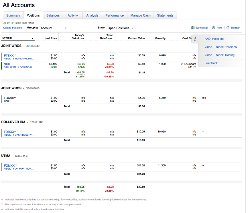
To modernize the platform, Fidelity launched an initiative to transition Accounts & Trade to a responsive web architecture. The central obstacle was the Positions Grid — a massive, data-dense table containing 13+ columns and potentially thousands of rows per user.
- Problem: The existing front-end team relied on JavaScript rendering that broke responsive layouts and caused mobile devices to freeze.
- Business Risk: The project was blocked for a full year due to technical debt and competing stakeholder requirements. Competition in the industry to deliver responsive experiences was aggressive. Leadership faced an aggressive 10-month deadline to deliver a customer-centric, mobile-ready solution.
The original fixed, desktop-only Positions grid
2. My Role & The Technical Breakthrough
Brought onto the initiative as a “design technologist / unicorn” — bridging high-level UX strategy, user research, and production-grade front-end development — I was tasked with embedding cutting-edge responsive web practices into the team.
Innovating Under Constraint
On my first day, after reviewing the broken layouts and device freezes, I prototyped an alternative approach in ~20 minutes:
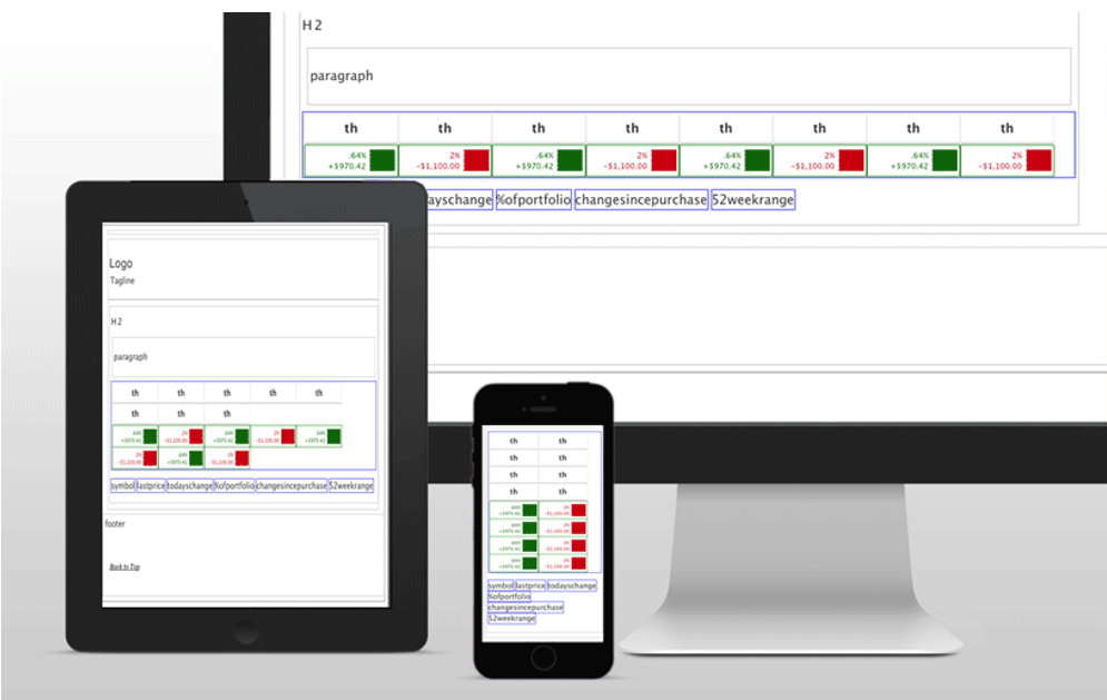
- The CSS Innovation: Instead of relying on heavy JavaScript layout recalculations, I engineered a lightweight CSS-based architecture using customized inline-block reflows with min-width and max-width rules tailored to financial data density.
- External Validation: Industry responsive web design pioneers Jason Grigsby and Aaron Gustafson audited the approach, confirming it as a groundbreaking, performant solution for complex enterprise data grids.
Early low-fidelity Notepad architecture sketch demonstrating the lightweight CSS-based table reflow logic
Navigating Culture & Earning Trust
Because engineering silos ran deep, the front-end team continued refining their JavaScript approach. Practicing “delivery as diplomacy,” I collaborated on their direction for three months while contributing IA, visual design, and development support.
When the JavaScript approach continued to freeze mobile devices during executive reviews, the Senior Vice President directed the entire organization to adopt my CSS-based architecture.
3. Discovery, Prototyping, & Real-Device Co-Design
Replacing the legacy codebase with the new CSS architecture, I partnered with our UX researcher and co-design lead to conduct rigorous usability testing in the lab.
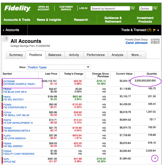
Testing minimum and maximum table values, sort/filter controls, and off-canvas drawers across platforms, browsers, and mobile devices to validate the layout
Stress-Testing Extreme Data Variants
The Positions grid serves a vast spectrum of investors—from individuals with a single mutual fund to high-net-worth clients managing thousands of line items and multi-billion-dollar portfolios.
Working alongside Business Analysts, we stress-tested our prototypes against both the smallest and largest possible edge-case values (e.g., multi-digit stock quantities, long ticker symbols, extreme currency figures).
We ensured table cells reflowed gracefully without truncating critical financial data or causing horizontal scroll paralysis.
Accessibility & Mobile-First Interaction Design
Direct user observation revealed key behavioral insights:
- Off-Canvas Navigation Drawers: We hid the complex “All Accounts” sidebar behind a gesture-friendly slide-out drawer, keeping the viewport focused on core portfolio data while keeping global navigation one tap away.
- Progressive Control Disclosure: We streamlined dense sorting and filtering controls into contextual overlays, reducing cognitive load on smaller screens.
- Accessibility: While red and green were used to convey meaning, those colors were paired with icons and aria-labels to ensure those with color vision differences would understand.
This all probably looks obvious to you now, but this was ground-breaking work in 2013–2014! I pioneered this reponsive data grid approach before many, but couldn’t talk about it because of the NDA.
4. Results & Institutional Impact
The finalized, responsive Fidelity.com Accounts & Trade experience across desktop, tablet, and mobile viewports.
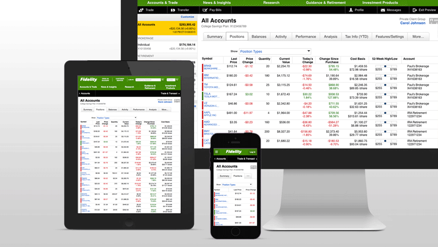
- Following the beta rollout, mobile adoption surged instantly with a 75% increase in mobile engagement, and the redesigned Positions grid became the most viewed page across Fidelity.com.
- The CSS architecture eliminated performance bottlenecks and device crashes, enabling the team to ship the 10-month emergency timeline on schedule, making up the year lost on the JS exploration.
- The responsive grid layout and component patterns established during this project became the foundational blueprint for Fidelity's company-wide Responsive Pattern Library.
- The project’s success and technical approach were featured on the official Responsive Web Design podcast.
“ Jen’s dedication to and focus on the correctness of her work was perpetual, specifically when it came to advocating for web accessibility and consistency in its implementation. From a design perspective I could always count on Jen to represent those concerns both during the ideation and development stages of a project, saving the development team a ton of time further on not having to retrofit our apps during QA (or in production!).” – Stephen McCall, Director, Architecture & Engineering at Fidelity Investments