FEMA FloodSmart.gov Responsive Redesign
Transforming hacked, impenetrable government copy into an accessible, human-centered civic portal that served 1.5M unique property owners in its first 90 days.
| Key Metadata | Details |
|---|---|
| My Role | Lead UX Designer, Information Architect, & Player-Coach |
| Primary Impact | Scaled portal from minimal/frustrated traffic to 1.5M unique visitors in 90 days; achieved full Section 508 accessibility compliance; established plain-language information architecture for the National Flood Insurance Program (NFIP). |
| Client & Sector | Federal Emergency Management Agency (FEMA) / GMMB (Subcontractor) |
| Team | Lead UX Designer (myself), UX Strategist, 2 Project Managers, Visual Designer, Front-End Developer |
| Core Skills | Civic Tech Leadership, Section 508 & WCAG Accessibility, Information Architecture, Card Sorting, Plain Language (PlainLanguage.gov), Rapid HTML/CSS/JS Prototyping, Stakeholder Diplomacy, Team Mentorship |
1. The Challenge: Crisis Recovery & Institutional Obstacles
FloodSmart.gov is the official digital portal for the National Flood Insurance Program (NFIP), administered by FEMA to provide millions of American property owners with essential flood risk and insurance resources.
Following a severe security compromise in 2016, FEMA urgently relocated FloodSmart’s content into nested, accordioned toggles on FEMA.gov.
- The Problem: The temporary migration resulted in dense, jargon-heavy “governmentese” buried inside hard-to-navigate accordions. Analytics showed near-zero meaningful engagement—users arrived, struggled to find critical flood insurance details, and immediately abandoned the site in frustration.
- Contractual Constraints: The federal task order timeline explicitly prohibited formal pre-design discovery research or a complete content rewrite prior to design delivery, requiring creative, agile workarounds to keep the user at the center.
2. Strategic Actions & Player-Coach Leadership
Brought on as Lead Designer, I established an empathetic, user-first design discipline while actively mentoring junior agency staff in responsive web practices and digital accessibility.
🛠️ "Guerrilla" Co-Design & Taxonomy Alignment
To honor the contract’s user-centered mandate without violating task order constraints, we initiated rapid, low-overhead remote research:
- Targeted Card Sorting: Conducted remote card sorts using Optimal Workshop, leveraging professional networks to source real property owners, specifically targeting residents living in active flood zones.
- Co-Creating the Information Architecture: Worked directly with participants to restructure the complex NFIP taxonomy into intuitive mental models, translating bureaucracy into plain language.
🤝 Stakeholder Diplomacy & Rapid Prototyping
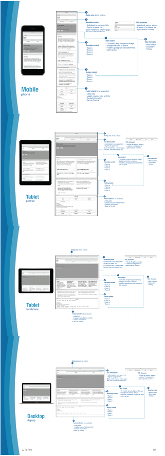
To align FEMA stakeholders and clarify the mechanics of responsive design early, I developed low-fidelity, interactive HTML/CSS wireframes alongside static presentation decks:
- Sleuth Stakeholder Discovery: Used initial review meetings to uncover unspoken client expectations, with static, annotated deck views [5.4MB PDF + links to HTML/CSS/JS prototypes] to bridge the gap between policy goals and user needs.
- Interactive Responsive Education: Shared live responsive links to demonstrate how fluid layouts adapt across mobile, tablet, and desktop viewports, building institutional alignment around modern web standards.
✍️ Plain Language & Content Wrangling
Partnered with FEMA content owners via GatherContent to audit, edit, and streamline legacy copy in alignment with PlainLanguage.gov guidelines—replacing bureaucratic terms with clear, actionable guidance.
👥 Pair-Programming & Team Mentorship
- Embedding Modern Standards: Pair-programmed with the visual designer and development team, teaching responsive design patterns, WCAG/Section 508 accessibility standards, and test-driven design.
- Handoff & Governance: Delivered high-fidelity HTML/CSS prototypes paired with performance benchmark specs and hands-on training so agency staff could measure and maintain UX quality post-launch.
Static wireframe delivered as print-out decks so client can answer to their leadership
3. Fostering Empathy in Government Leadership
One of the most rewarding moments of the initiative occurred during a formal design review with FEMA leadership. When reviewing the simplified "Need Help?" page, the Chief of Communications initially remarked that the layout looked plain. He then paused, pointed to me, and said:
“When I think of the user, it needs to be quick and easy to read, understand, and get me where I need to go—so this is actually great. We don’t need big pictures here!”
It was a powerful validation that our research storytelling had successfully shifted the agency's mindset from marketing aesthetics to true user empathy.
4. Results & Public Impact
The redesigned, fully responsive FloodSmart.gov “For Consumers” portal across mobile and desktop devices.
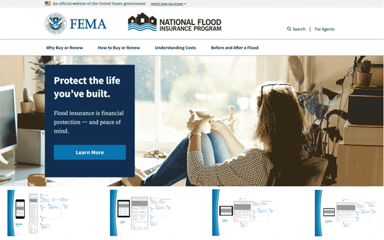
- Immediate Traffic Surge: The refreshed, Section 508-compliant "For Consumers" portal launched## Key Insights & Structural Strengths
- Methodological Resilience: You successfully bypassed contract and schedule constraints by leveraging guerrilla card sorting via Optimal Workshop to build a user-backed taxonomy when official preliminary research was out of scope.
- Proactive Stakeholder Alignment: Using lo-fi responsive HTML wireframes as a probe during early client reviews allowed you to discover implicit stakeholder expectations, clarify responsive behavior early, and anchor feedback on content rather than visual chrome.
- Focus on Measurable Outcomes: Modernizing the content via Plain Language guidelines and structural accessibility directly transformed the site from an underperforming, buried set of toggles on FEMA.gov into a distinct portal that served nearly 1.5 million unique visitors in its first three months post-launch.
- Capacity Building: Hands-on pair programming and embedded training in accessibility, test-driven design, and responsive layouts left the client and development teams with lasting technical documentation and testing workflows.
| Dimension | Details |
|---|---|
| Project & Client | FloodSmart.gov Responsive Redesign (FEMA / NFIP) via GMMB |
| Primary Goal | Rebuild and reorganize hacked, dense, highly technical flood insurance content into a user-centered, plain-language, fully accessible web portal. |
| Target Audience | U.S. property owners seeking National Flood Insurance Program resources and purchasing pathways. |
| Core Impact | 1.5M unique visitors in the first 3 months post-launch (June–August 2018); primary traffic routed directly to core tasks (risk assessment, agent contacts, purchasing). |
| Technical & Design Focus | Section 508 / WCAG compliance, Plain Language integration, responsive HTML/CSS/JS prototyping, taxonomy card sorting, design team mentoring. |
Strategic Process & Execution
1. Guerrilla Research & Information Architecture
When formal upfront research was omitted from the task order, you identified property owners in active flood zones via social networks and ran remote card sorts using Optimal Workshop. This data-driven approach directly reshaped the site map and content taxonomy, ensuring navigation matched real mental models rather than internal agency jargon.
2. Stakeholder Facilitation & Live Prototyping
To align federal stakeholders early:
- Built interactive, lo-fi HTML/CSS wireframes alongside mood boards to demonstrate responsive layout mechanics.
- Used static, annotated deck views [5.4MB PDF + links to HTML/CSS/JS prototypes] in meetings to deliberately channel client attention toward plain-language content and structural hierarchy, avoiding premature debates over visual design.
- Uncovered hidden stakeholder assumptions early in the process, avoiding costly late-stage revisions.
3. Content Refinement & Plain Language
- Audited and managed content migration through GatherContent.
- Rewrote dense government copy using PlainLanguage.gov principles, optimizing readability for stressed or time-sensitive property owners.
- Re-architected high-intent pathways, such as the streamlined “Need Help?” view, prioritizing fast task completion over decorative visuals.
4. Accessibility, Handoff & Technical Mentorship
- Mentored visual designers and developers in-flight through pair programming, teaching responsive web design, WCAG/Section 508 standards, and test-driven design.
- Delivered high-fidelity, accessible HTML/CSS/JS prototypes paired with key performance indicators (KPIs), code specifications, and routine UX testing guidelines for downstream teams.
Disclaimer
The live FloodSmart.gov site has undergone subsequent vendor redesigns and policy changes since our 2018 delivery. Features on the current site (including non-pausable background media and revised media hierarchies) do not reflect the accessible, human-centered standards implemented during my tenure. The “For Agents” site was done by an entirely different team.